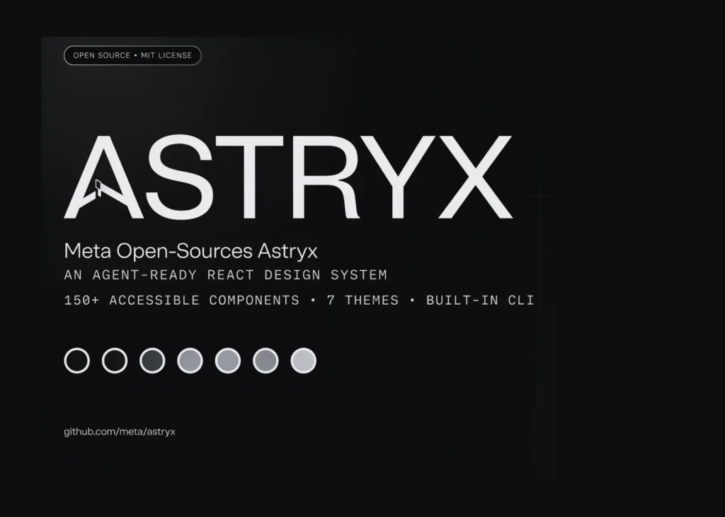
Meta has released Astryx, an open-source design system in beta that combines over 150 accessible components, seven themes, and a command-line interface for use by both developers and AI agents. The system is built on React and StyleX, offering pre-compiled CSS to eliminate the need for build plugins or additional styling libraries. It is the result of eight years of internal development at Meta, having become the company’s primary interface framework for thousands of applications.
Separating behaviour from branding
Traditional design systems often force a trade-off between consistency and uniqueness. Adopting a large corporate system can make an application feel generic, while copying components individually leads to fragmented codebases with poor accessibility and maintenance issues. Astryx resolves this by decoupling functional logic from visual identity. The core system enforces accessibility, usability, and quality standards, while themes control the aesthetic presentation.
Customisation happens at the token level—adjusting colour, typography, spacing, and motion—allowing teams to create a distinct brand identity without rewriting component code. A theme is essentially a set of CSS custom property overrides. This means a designer can alter the look of the application by changing token values, ensuring the interface remains unmistakably their own.
The system operates on four principles: guidance over enforcement, strong documented conventions, a unified approach for humans and AI, and measurement-based validation. Conventions are tested rather than assumed.
Architecture and component layers
The system is structured into three distinct layers. Foundations provide the primitives for accessible interfaces, including typography, colour, layout, and accessibility rules. Components consist of more than 150 reusable building blocks, all fully supported by TypeScript. Patterns offer battle-tested solutions for specific workflows, such as data tables, detail views, form wizards, and navigation structures.
Two architectural decisions enhance its openness. Components can be composed at any level rather than being locked behind a rigid top-level API. Additionally, the `swizzle` command allows developers to eject a component’s full source code into their project if they require complete ownership. Styling is managed via StyleX but remains invisible to consumers, enabling overrides using `className` with Tailwind, CSS modules, or plain CSS—whatever the project already employs.
Designed for AI agents
Meta positions Astryx as a response to the shift toward AI-generated software. As agents write more code, design systems must be engineered for automation rather than patched afterwards. The API, conventions, documentation, and CLI were designed simultaneously to ensure that both humans and AI assistants build in the same way. Every feature that assists an AI also improves the experience for developers.
This is evident in the tooling. The CLI, identified as `@astryxdesign/cli`, can list and scaffold templates, generate documentation, create themes, run code modifications to migrate versions, and surface machine-readable documentation via the command line or Model Context Protocol (MCP). Components follow consistent naming, prop, and composition rules, allowing models to predict the behaviour of unfamiliar elements after learning a few examples.
Deployment requirements
As a front-end library, deploying Astryx involves adding it to a React application. The core package, `@astryxdesign/core`, requires React and react-dom version 19.0.0 or higher as peer dependencies, alongside StyleX. It ships with pre-built CSS, removing the need for PostCSS or Babel configuration. Supported environments include Next.js with Tailwind, Next.js with StyleX, Vite, and a no-build CDN path via the UMD bundle on unpkg or jsDelivr. An interactive checker can generate specific installation and setup steps for a given tech stack.
What it means
For developers, the immediate change is the removal of configuration friction. Teams no longer need to spend time setting up build plugins or wrestling with styling libraries to maintain consistency. The pre-built CSS allows for rapid integration, while the token-based theming ensures that branding remains flexible without compromising the underlying structure. For AI users, the system provides a predictable environment where generated code adheres to established patterns, reducing the likelihood of errors and simplifying maintenance.